pashabank.az Website
Category
Website
/
Transforming a 20-year legacy corporate banking platform into an intuitive, interactive, and user-centric digital hub.

Overview
pashabank.az is the primary digital flagship of Azerbaijan’s leading corporate and retail banking institution. The platform’s legacy design dated back to 2007 and had remained largely unchanged for nearly two decades. This resulted in massive technical and design debt, an unresponsive interface, and a fragmented user experience that struggled to support modern financial consumer behaviors.
As a Product Designer on this multi-disciplinary initiative, I collaborated closely with UX/UI peers, graphic designers, product owners, and marketing team to completely reimagine the web experience from the ground up.
Role: Product Designer (SME, Retail, Careers, and Service Network tracks)
Team: Cross-functional squad (UX/UI, Graphic Design, Marketing, Engineering)
Status: Currently in final-touch production stages with the Beta version successfully live in prod.
Core Objective: Deconstruct complex, data-heavy financial products into intuitive web interfaces while boosting self-service conversions.
Team
Project Manager - Babakhan Malikli
Content Writer - Naila Jabrayilova
Graphic Designer - Miri Elvin
Developer (Vendor) - MediaDesign
UX/UI Designers - Ruslan Sharifov, Fuad Isgandarov, Tellikhanım Guliyeva, Tapdig Aliyev
The Legacy Challenge
In 2007, websites were built as static, text-dense informational brochures. Over nineteen years, PASHA Bank’s offerings scaled exponentially, but the digital interface remained frozen in time.
The Key Problems We Faced:
Information Overload: Critical banking data, terms, and conditions were buried inside dense walls of legalistic text, driving up user drop-off rates.
Lack of Functional Interactivity: The site was entirely passive. Users looking to calculate loan rates or deposit yields had to dig through complex PDF fee schedules or manually contact a relationship manager.
Fragmented Branding: Over time, marketing priorities and product lines evolved independently, creating an inconsistent visual vocabulary across different business segments.

Collaboration & Process
Designing for an enterprise-level financial institution requires aligning competing priorities. Our design team did not work in a silo; we established a tight feedback loop with the Marketing Team to safeguard brand positioning and the Graphic Design Team to ensure asset cohesion.
Through iterative workshops and design reviews, we translated strict business and regulatory requirements into streamlined, user-friendly layouts.
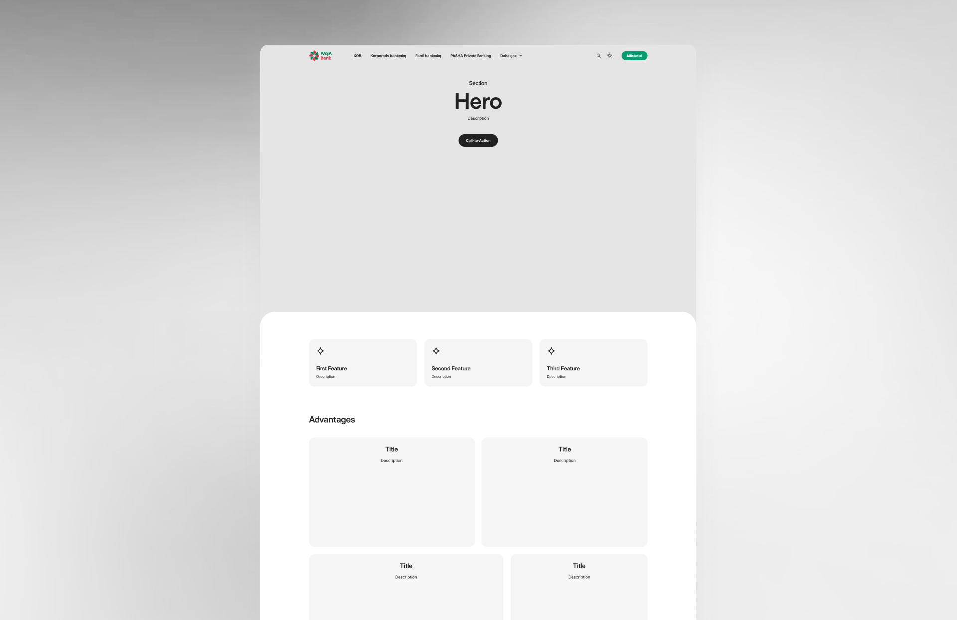
Designing Core Ecosystem Segments
Small & Medium Enterprises (SME) & Retail Portals
Business owners and retail consumers require fast, friction-free paths to financial data. I shifted these sections away from exhausting text structures toward clean, component-driven layouts (leveraging scannable data grids and cards).
Interactive Utility: I designed intuitive components, such as Loan and Deposit Calculators. Instead of guessing or calling a branch, users can now input variables via seamless sliders to instantly visualize their deposit incomes or monthly credit repayments.


Careers
Corporate websites are major employer-branding drivers. I restructured the Careers portal into an immersive narrative experience. By replacing static, text-heavy vacancy lists with dynamic role filtering and transparent recruitment timelines, we turned a high-friction application process into an aspirational candidate journey.

About Us
A company website shouldn't be a boring wall of text. I worked with Tellikhanım Guliyeva to redesign the "About Us" section because we wanted to share our bank’s real story and values in an interesting way. Instead of long, confusing paragraphs, we turned years of history into a simple timeline slider that users can click through. We also turned heavy financial numbers into clean, easy-to-read charts so visitors can easily understand our growth and trust the bank.

Service Network (Branches & ATMs)
The old branch locator was a static address list. I redesigned the Service Network into an interactive, map-integrated spatial UX. Users can now easily filter between corporate branches, retail centers, or 24/7 ATMs, viewing real-time operating hours and services at a glance.

Key Design & Product Decisions
Simplifying Financial Literacy: Our core philosophy was "Clarity over Complexity." We intentionally designed the interface to hide low-priority regulatory text behind progressive disclosure elements (like expandable accordions and tooltips), keeping the primary interface remarkably clean.
Responsive Framework: Built a bulletproof responsive system ensuring absolute feature parity across mobile viewports, tablets, and massive desktop screens.
Component-Driven Scale: Designed atomic UI elements—buttons, forms, input systems, and alert modules—to ensure consistency across the hundreds of sub-pages we overhauled.
Impact & Professional Growth
The platform is currently undergoing final visual and functional polish in its Beta phase live in production, with early analytics showing significant improvements in user sessions and interactive tool engagements.
On a personal level, this initiative proved the immense value of cross-departmental alignment. Navigating the diverse perspectives of marketing specialists, graphic artists, and technical teams allowed us to build a product that is not only visually striking but mathematically functional. We successfully transitioned pashabank.az from an outdated web directory into a high-converting, interactive product hub fit for modern digital banking.

